

Creators.org is an organization founded by top executives of the creator economy, with the mission to advance creators' rights and foster a better internet for all.
BRIEF
Create a ‘Minimum Viable Brand’ as a starting point for the new organization to launch.
Design it in a way that is attractive, scalable, and manageable by non-designers.

Behind the Creators.org Identity
Creators.org emerged from a profound need to recognize the growing class of professional creators who are shaping the modern economy.
With over two million professional creators, and countless others earning their livelihoods through distributed content, Creators.org serves as a beacon of unity and support for these talented individuals.

“This brand is about coming together, pursuing something larger than any individual.”
EZRA COOPERSTEIN / President @ Night Media
The Logo:
A Deeper Dive


The mark comprises two key elements: the letters "C" and "O". "C" stands for "Creators," the lifeblood of the organization, while "O" stands for "ORG," emphasizing the collective and organizational aspect of the platform.
Not only are these the first two letters of the brand's name, but "CO" also signifies “common, mutual, joint”, embodying the soul of the organization.

The three shapes within "cCO" can be interpreted as the silhouettes of three creators standing shoulder to shoulder, united in their pursuit of a common purpose.
This symbolizes collaboration, mutual support, and the strength that emerges when creators unite to effect change.
Must appeal to creators,
as well as platforms and institutions.
KEY INSIGHT
Institutional
with an Edge
The visual identity of Creators.org is designed to strike a balance between an institutional presence and an edgy, vibrant personality.
The selected typeface, Instrument Sans, combines functionality with elegant shapes, embodying neutrality and timelessness.
This neutrality allows the visual identity to assume a secondary role, placing creators in the spotlight.
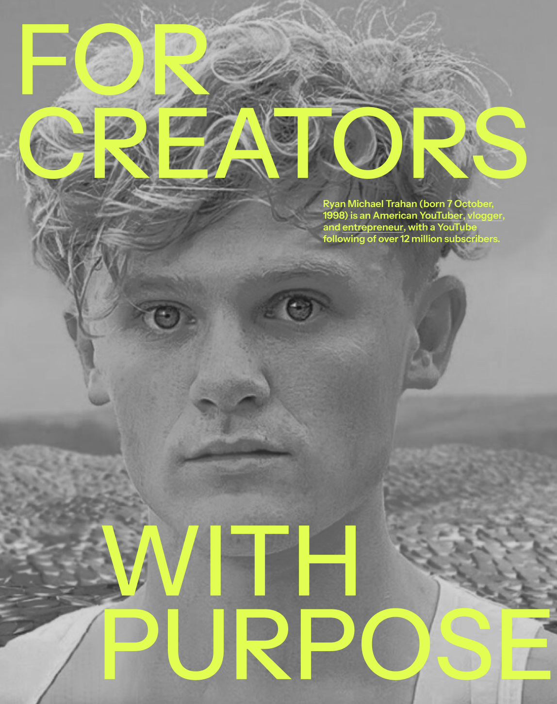
The strategic use of bright colors for the typeface over neutral backgrounds infuses vitality and energy into the identity.